The Challenge
We were tasked in incubating a new name and logo for a venture startup for Hitachi.
The Solution
After conducting research and brainstorming names, we arrived at Satori. Satori means sudden enlightenment and moment of total presence.
Art Direction
The Satori logo has a minimalist aesthetic, with a clean, uncluttered design that puts the wordmark center stage.
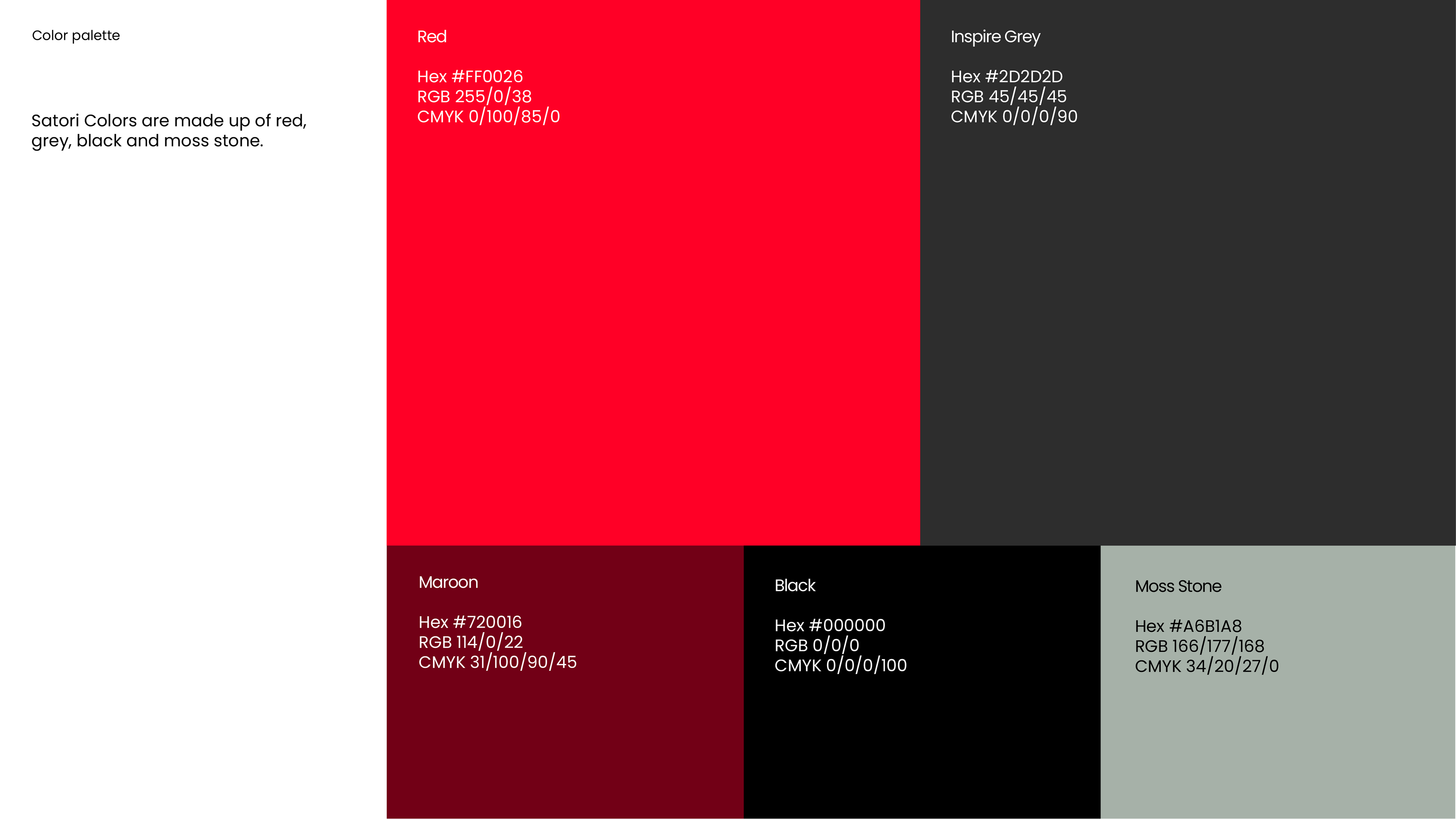
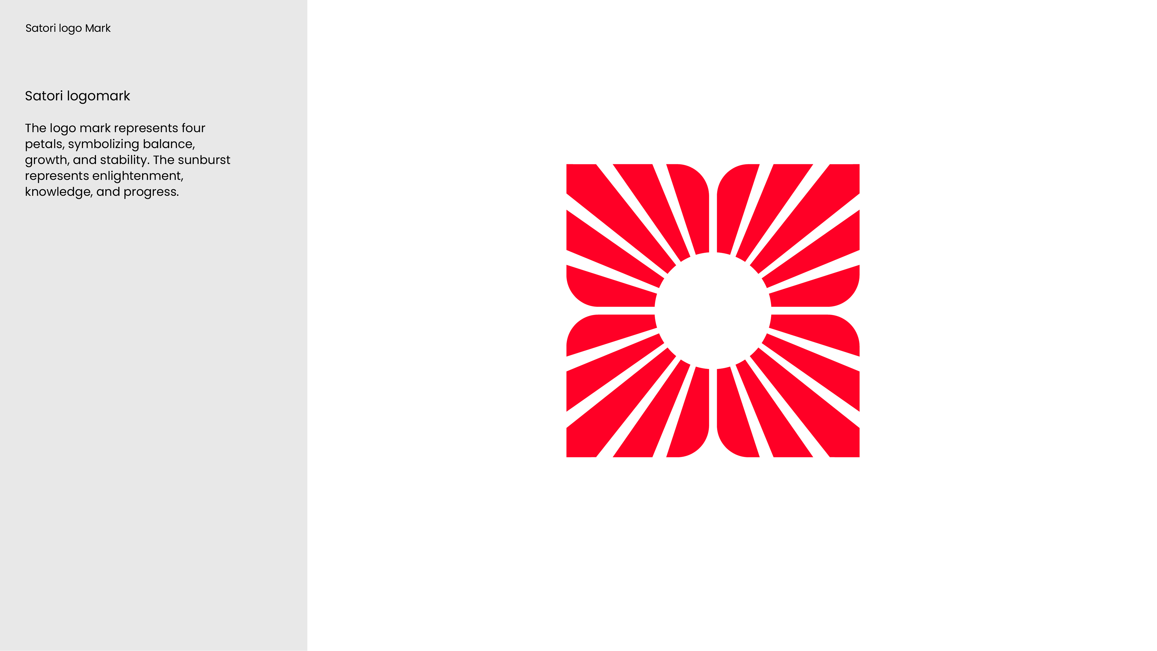
The main element is a stylized sunburst, symbolizing energy, renewal, and hope. The stylized petals surrounding the sunburst represent balance, growth, stability, and sustainability. The red and gray add dynamism and professionalism while remaining consistent with the Mothership's color palette.
The "O" in Satori also contributes to the logo's narrative. A significant symbol in Japan, the hand-drawn circle—often created in one brushstroke—expresses the circularity of life, showing its beginning and end. It symbolizes enlightenment, strength, elegance, and the universe.
Tools: Illustrator, Photoshop
The Results
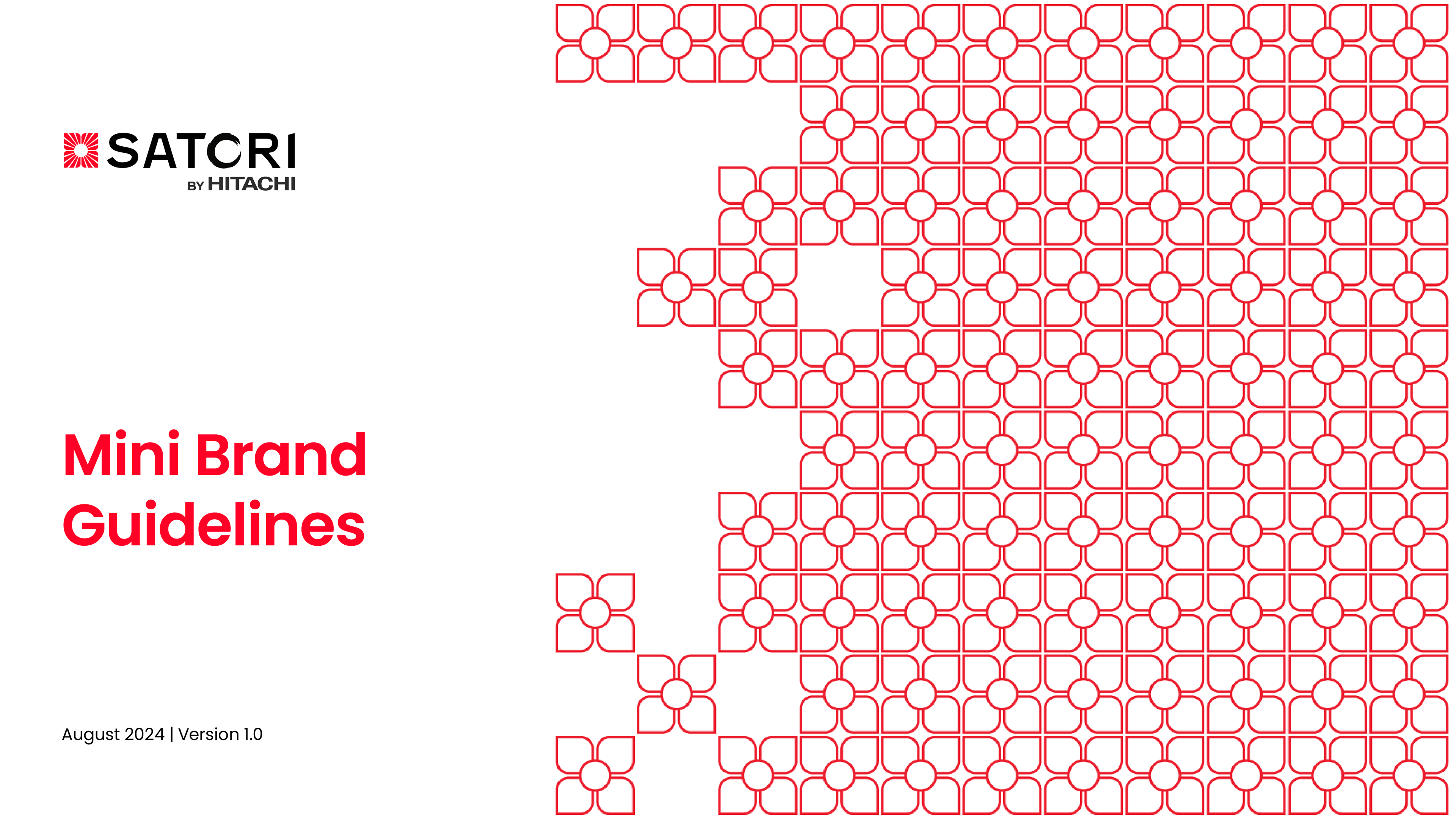
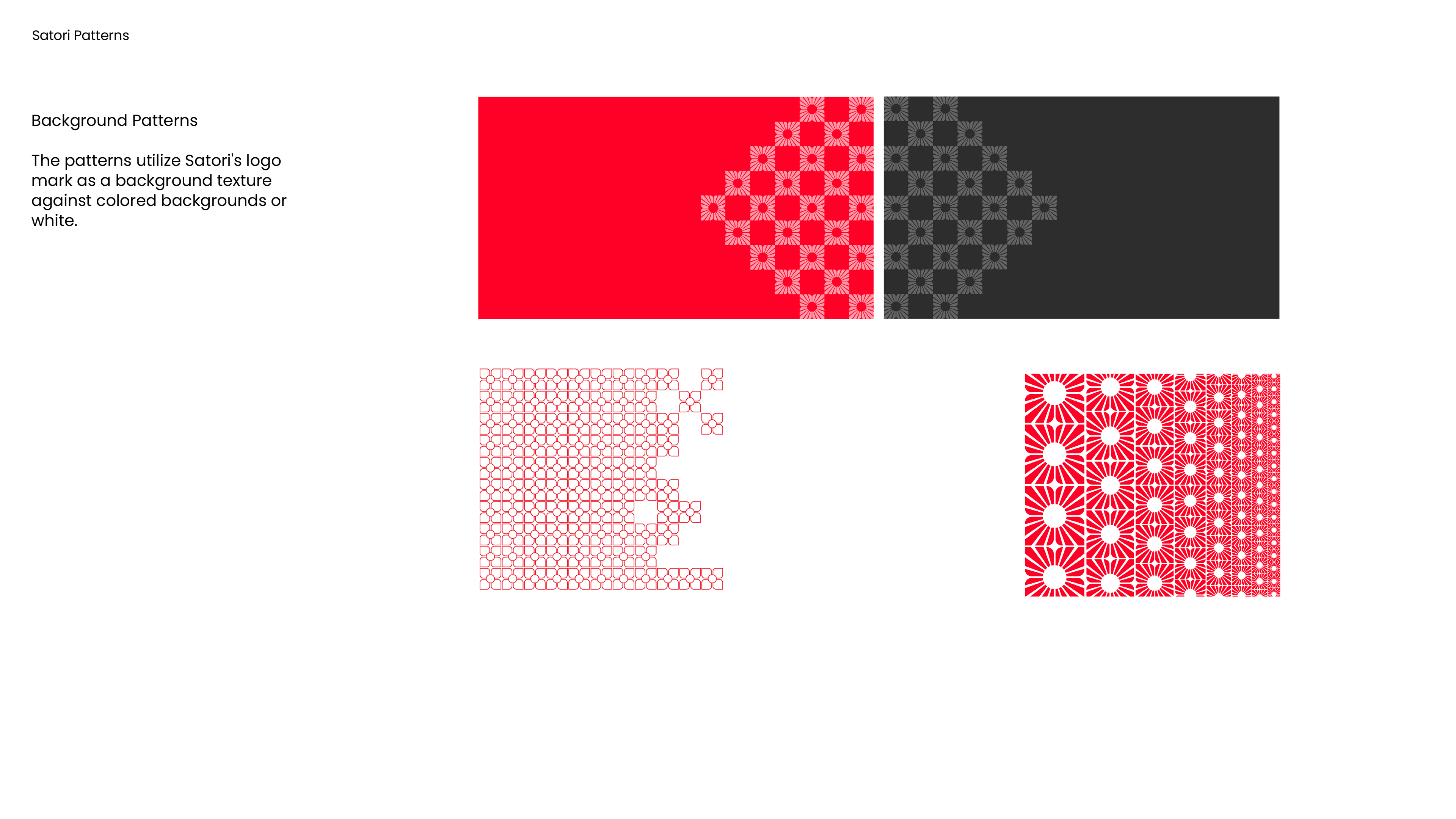
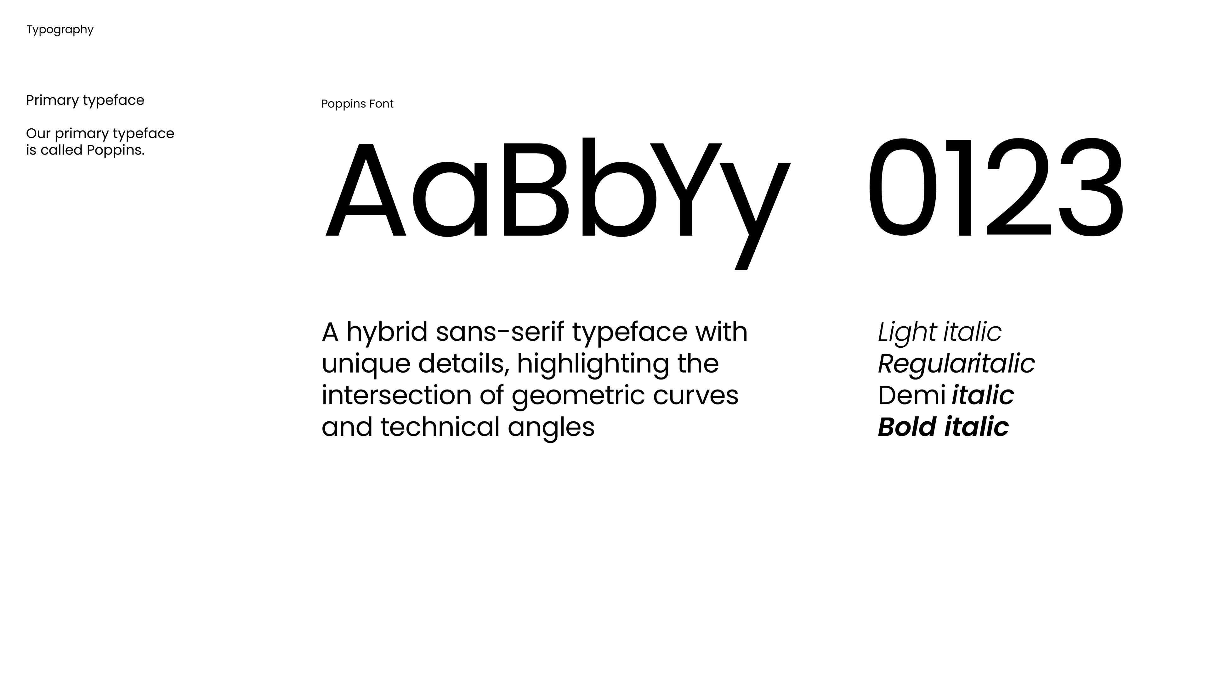
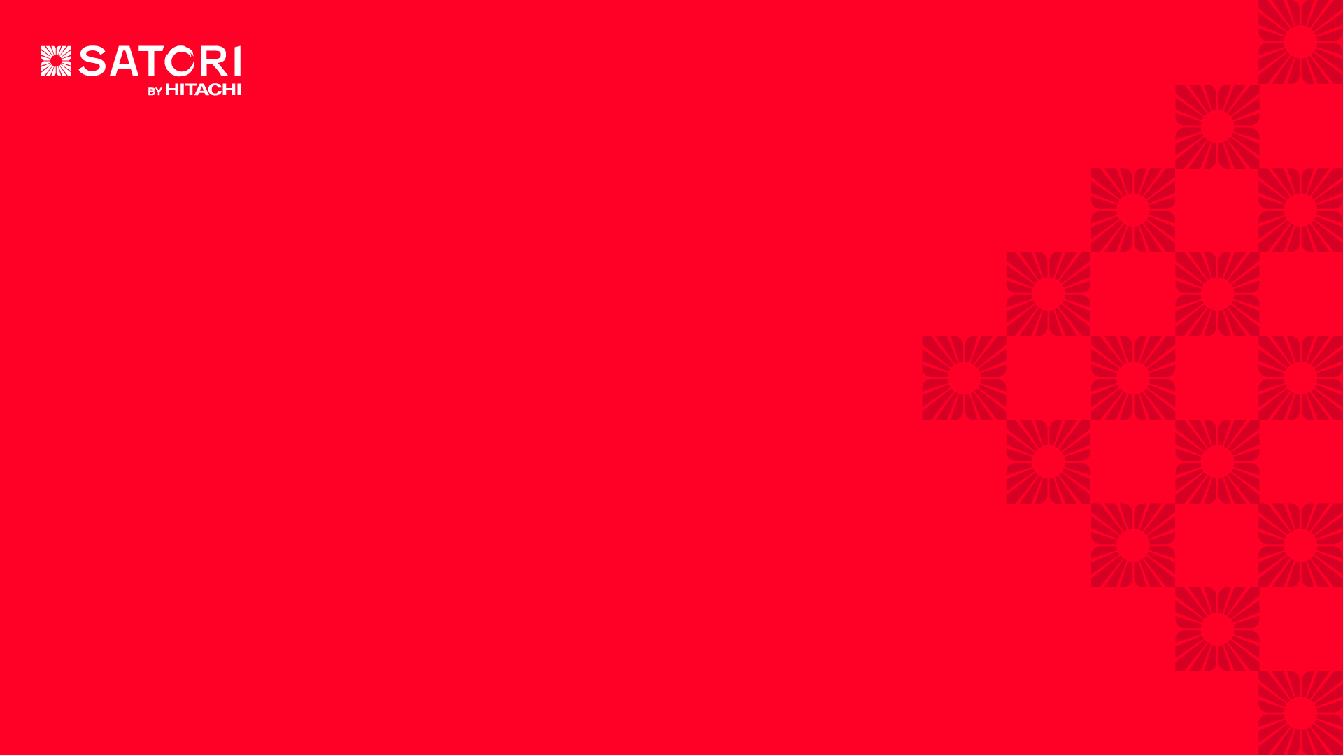
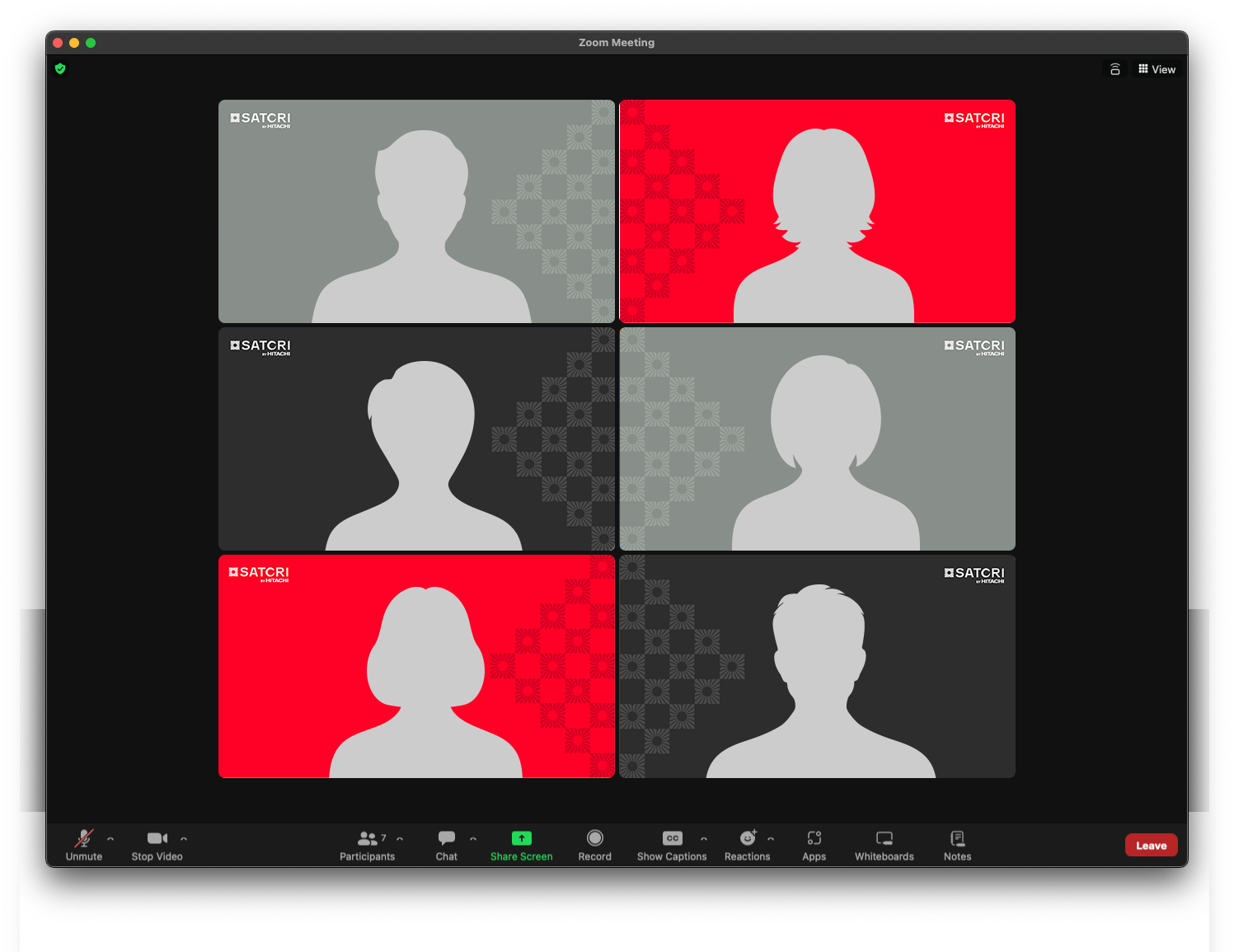
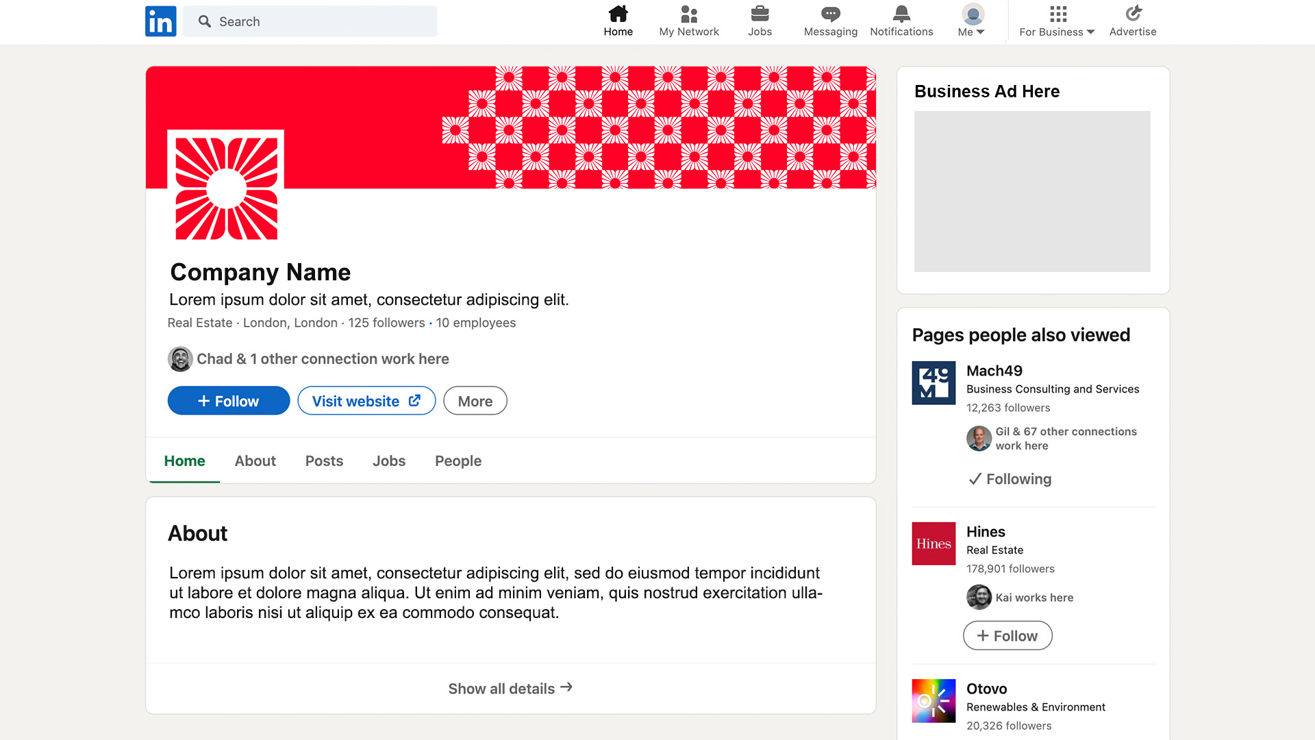
The client chose my logo design, and we proceeded to create a mini brand guideline and deliverables such as Zoom backgrounds, LinkedIn profile assets, and background textures.
