The Challenge
We were tasked with incubating a new name and logo for a venture startup of Grupo AG. Grupo AG wanted a name and logo that best represented its trucking industry in Guatemala.
The Solution
After conducting research and brainstorming names, we arrived at Camionando. Camionando means a path.
Art Direction
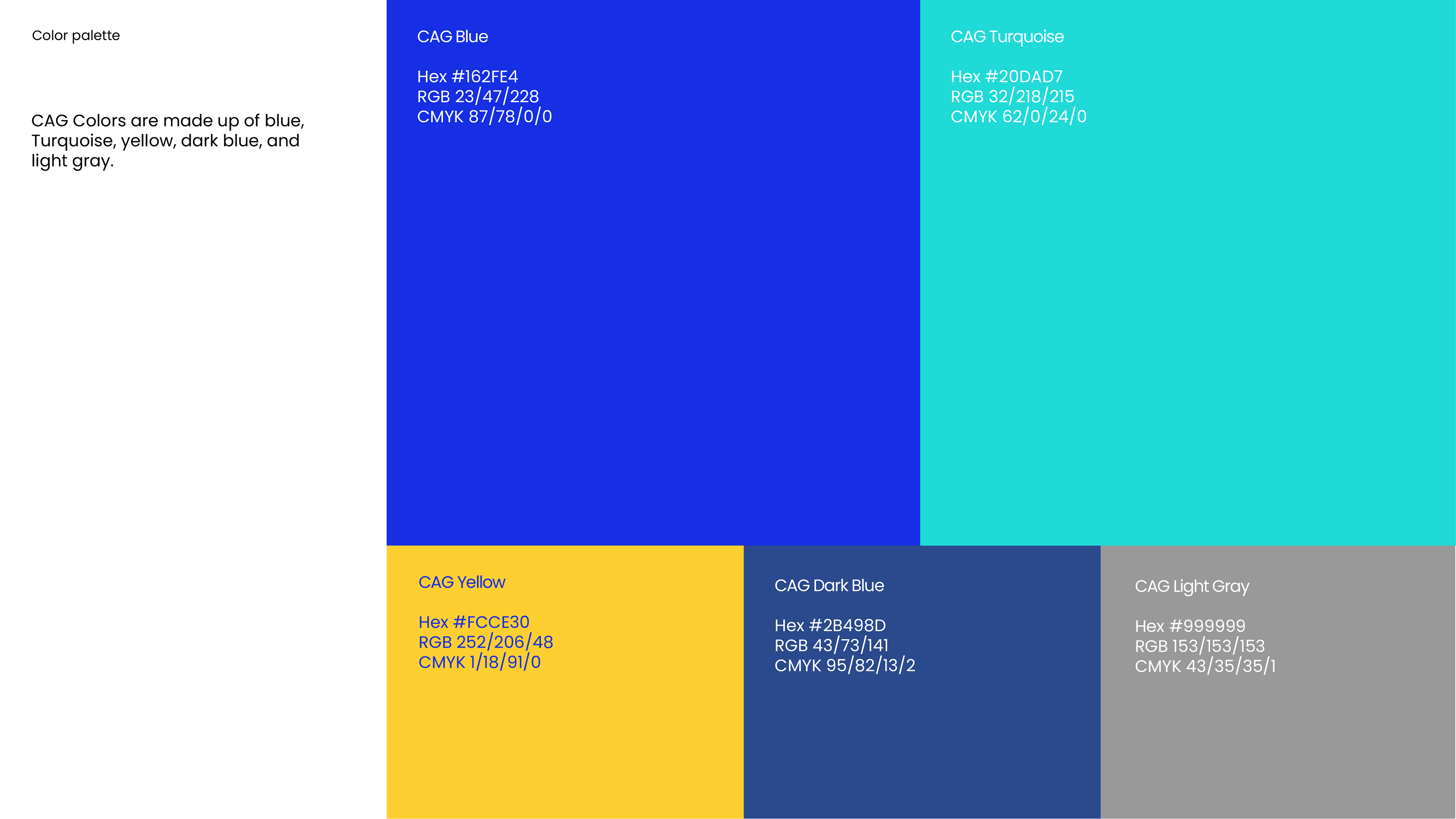
I began by exploring different ways to typeset "CAMIONANDO." I found uppercase letters to be effective and experimented with a two-color scheme using blue, turquoise, and a hint of yellow. Blue represents trust, reliability, and security, while turquoise represents movement and progress. Yellow symbolizes energy and optimism. The gradient reinforces the concept of movement and momentum in truck driving.
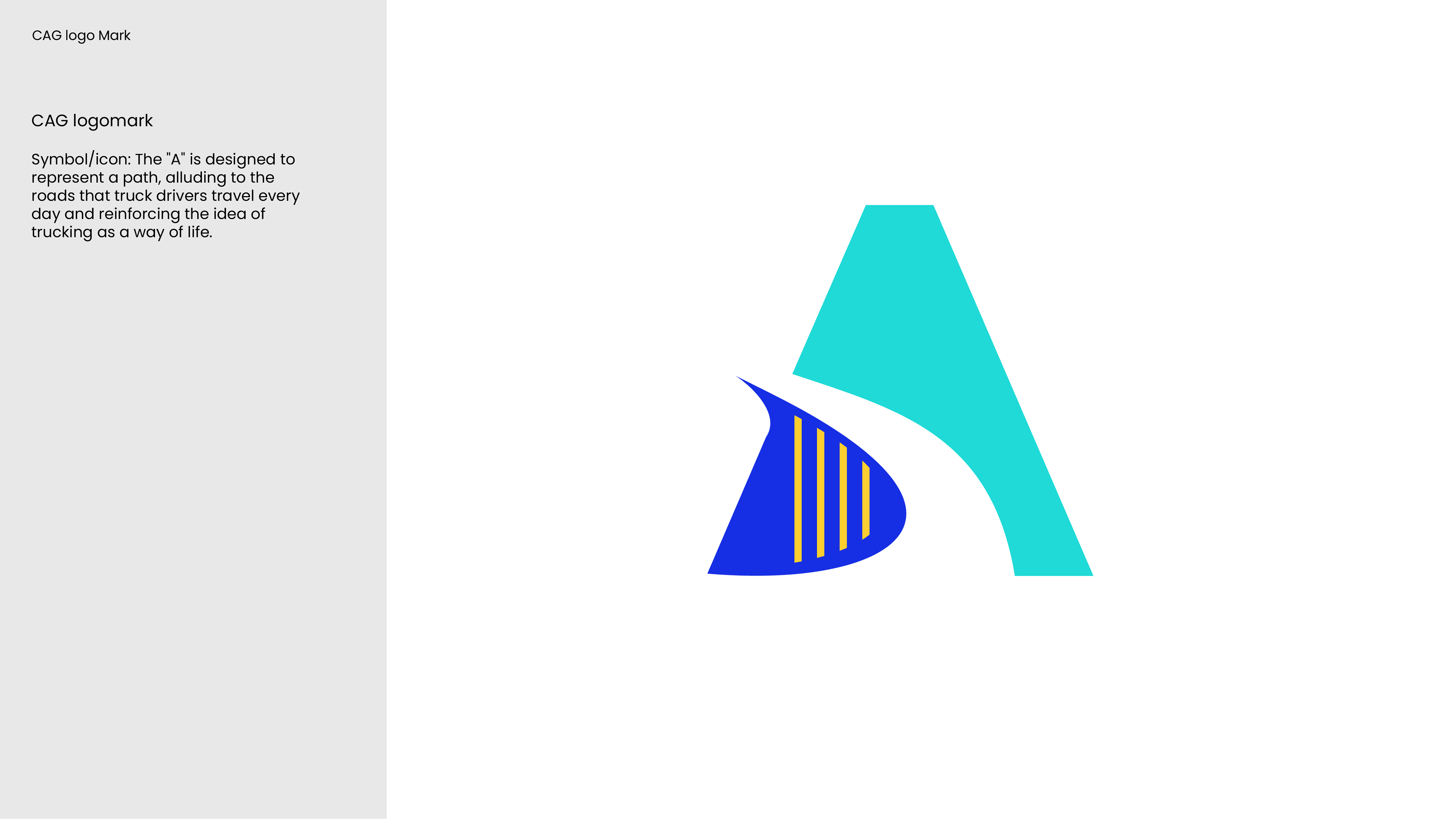
The "A" is designed to represent a path, alluding to the roads truck drivers travel daily.
Tools: Illustrator, Photoshop
The Results
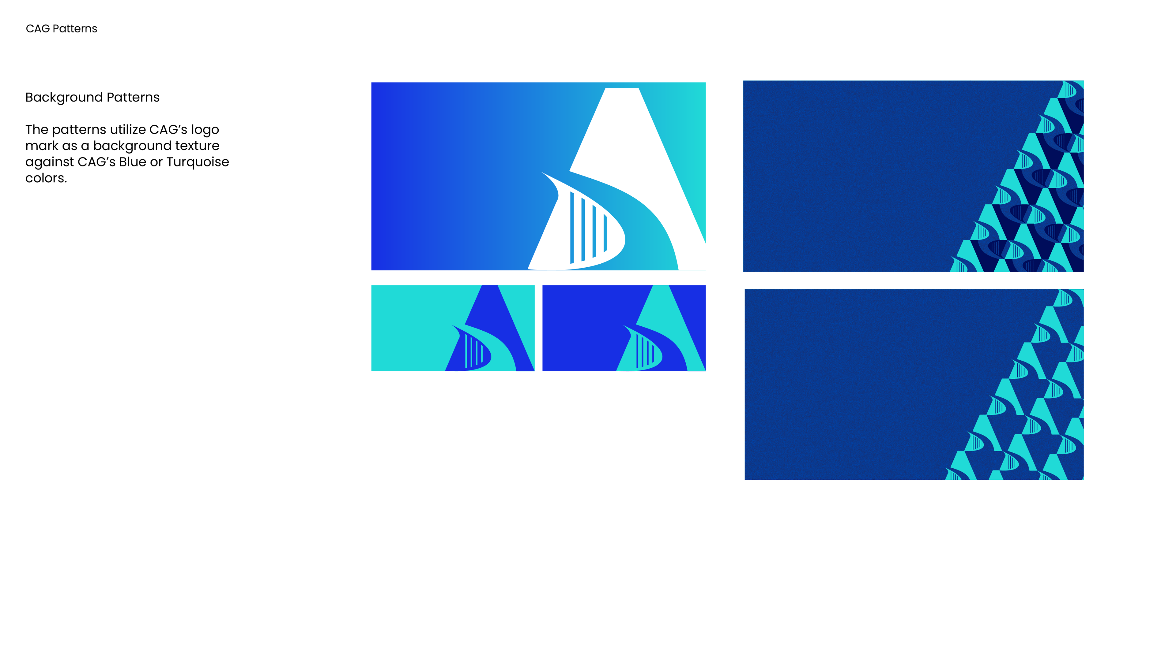
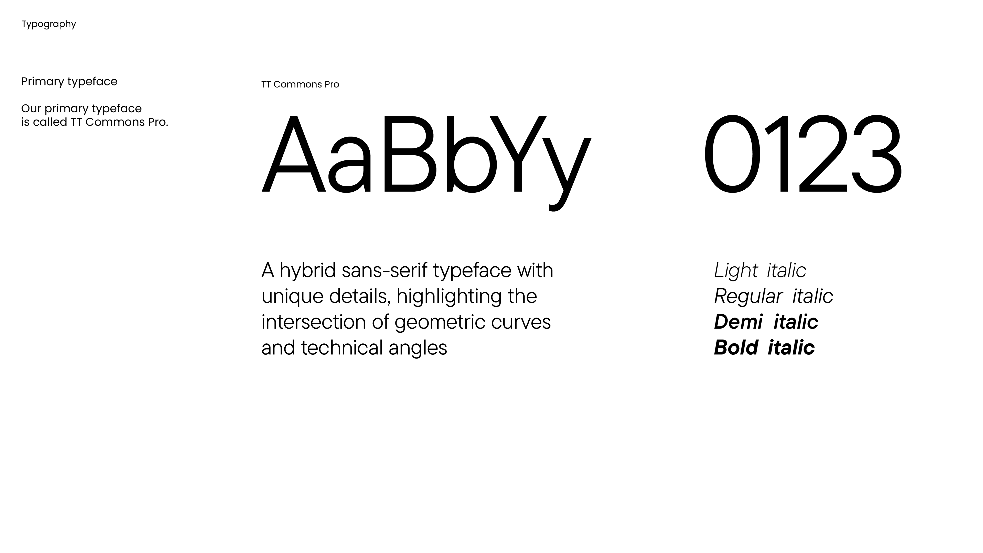
The client chose my logo design, and we proceeded to create a mini brand guideline and deliverables such as Zoom backgrounds, and background textures and illustrations.
